 Tweet
Tweet
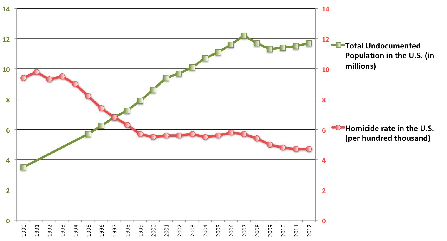
I was reading this morning, and decided to look up crime statistics of illegal aliens in the US. I ran into another Huff article, with a misleading graph (although pretty funny in the naive, or more likely, disingenuous author's attempt).
It is a graph with basically two lines creating an X . The lower left to upper right line shows the steep growth of the illegal population in the US. The other line, upper left to lower right, shows the downward slope of homicides in the US.
So there you have it....proof!
[B] There's just one problem, it doesn't include a very important piece of information, the PERCENTAGE of those murders committed by illegal aliens. You see the lines on the graph used have no correlation./B]
Comment